
How to Display Jewish Art in Modern Home Without Losing Meaning
How to Display Jewish Art in Modern Home Without Losing Meaning
Knowing how to display jewish art in modern home settings becomes straightforward once you treat the work as art first and symbol second. The pieces that succeed in contemporary interiors are chosen for their visual language, scale, and palette, not just their subject matter. This guide walks through placement, framing, and pairing advice room by room, so the result feels considered rather than coincidental.
Why Modern Jewish Homes Struggle to Display Judaica With Confidence
The tension is real and worth naming directly. Many Jewish homeowners have grown up seeing Judaica displayed in a very specific way: ornate frames, dense Hebrew text, heavy gold tones, clustered near the front door. That visual vocabulary belongs to a particular era of interior design, and it clashes with the clean lines, neutral palettes, and open plans that define most contemporary homes.
The result is often one of two overcorrections. Either the art gets hidden away because it feels too "shul-like" for the living room, or it gets placed without real intention and ends up looking like an afterthought on an otherwise cohesive wall. Neither serves the homeowner or the art.
The good news is that the problem is almost never the subject matter. Jerusalem, the Western Wall, the seven species of Israel, abstract interpretations of prayer, these are rich, visually compelling themes. The issue is usually style, scale, or framing. Solve those three variables and the discomfort disappears.
If you want a deeper grounding in how contemporary Judaica differs from its traditional counterparts, the piece on modern Judaica versus traditional Jewish decor covers the distinction clearly and is worth reading before you shop.
Understanding the Line Between Decorative and Meaningful in Jewish Art
There is a persistent myth that making Jewish art "more modern" means stripping away its meaning. It does not. It means choosing work that carries meaning through visual quality rather than through explicit religious iconography alone.
Think about how a museum hangs a Rothko. The painting is deeply emotional and often spiritually charged, but nothing about the hanging announces that. The work does the communicating. Strong contemporary Judaica operates the same way. A piece that interprets the Kotel through layered acrylic and shifting blue tones says something profound without needing a caption.
The practical test is this: if you had to explain the meaning to a guest before they could appreciate the piece visually, the framing or the work itself may not be pulling its weight. Good art earns attention on its own terms first. The story behind it deepens that attention rather than creating it.
This distinction also matters for placement. Art that relies purely on text or symbol for its impact needs a reading context, near a doorway, above a console, somewhere people pause. Art that works visually can command a sofa wall, a dining room focal point, or a staircase landing.

Choosing the Right Style of Jewish Art for a Contemporary Space
A simple three-step method helps narrow the field quickly: start with mood, then consider color temperature, then settle on scale.
Mood first. Do you want the room to feel contemplative, joyful, grounded, or expansive? Jerusalem themes tend toward depth and reverence. Abstract interpretations of prayer or Torah imagery can read as either meditative or energetic depending on the artist's hand. The Seven Species, pomegranates, vines, wheat, can bring warmth and life, particularly in dining spaces.
Color temperature second. Most contemporary interiors run cool (white walls, gray stone, pale wood) or warm (plaster tones, walnut, terracotta). Before choosing a piece, identify which camp your room falls into. Cool rooms welcome blues, silvers, and soft whites; warm rooms pull in golds, ambers, and deep ochres. A piece with the wrong color temperature will always feel slightly off, no matter how well it is hung.
Scale last. This is where most buyers make mistakes, defaulting to pieces that are too small for the wall. A general rule: the art should occupy 57 to 75 percent of the available wall width above a piece of furniture. On a blank wall with no anchor furniture, a single large canvas or a group of pieces should fill at least half the visual field.
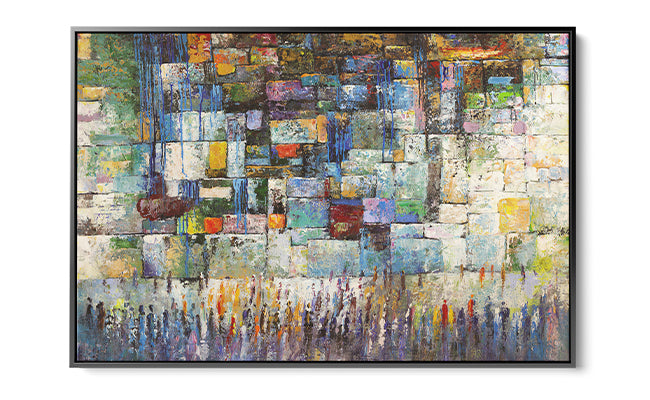
For contemporary and minimalist interiors, abstract Judaica in acrylic tends to perform best. The medium has a natural luminosity that reads well in spaces with good natural light, and it holds up against the reflective surfaces common in modern kitchens and living rooms. You can explore a strong range of these approaches through contemporary Jewish wall art masterpieces to get a sense of how different artists handle scale and abstraction.

Room-by-Room Placement Guide for Jewish Wall Art in a Modern Home
Each room has a different visual logic, and Judaica placed well in one space may feel completely wrong in another. Here is how to think through each major room.
Entryway and Foyer
This is the room with the most established Jewish precedent, the mezuzah, the blessing for the home, and it is also the room where people most often over-place. Resist the urge to hang multiple pieces at the entry. One strong vertical work or a single horizontal canvas at eye level (center at roughly 57 to 60 inches from the floor) does more than a crowded arrangement.
Abstract interpretations of the Gates of Jerusalem or the Jaffa Gate work particularly well here because the threshold imagery echoes the physical act of entering. The visual metaphor lands without explanation.
Living Room
The sofa wall is the living room's primary canvas. A large-format piece, something in the 36 x 48 inch range or larger for rooms with ceilings above 9 feet, anchors the seating area and gives guests something to look at from across the room. Abstract Judaica in blues and grays reads easily against the warm neutrals common in contemporary living rooms.
If your room already has strong architectural features (exposed concrete, large windows, open shelving), choose a piece with a quieter palette. The art should hold its own without competing with the room's structure.
Styling note: In open-plan spaces, the art on the living room wall also needs to read from the kitchen or dining area. Choose pieces with enough visual contrast to be legible at 20 to 25 feet. Abstract compositions with clear tonal shifts work better at distance than densely detailed figurative works.
Dining Room
The wall opposite the seat of honor at the table, or the wall visible from most seats, is where you want your most meaningful piece. Dining rooms are spaces of gathering, Shabbat, holidays, family meals, and the art there participates in that ritual whether or not it is consciously noticed.
Warm tones (golds, ambers, deep blues) suit dining rooms well because they feel generous rather than austere. The Seven Species of Israel is a natural fit here thematically and visually: abundance, land, harvest. If your dining table seats eight or more, consider a piece at least 40 inches wide to hold the scale of the room.
Home Office or Study
This is an underused room for Jewish art and one of the best. A piece with contemplative depth, an abstract Kotel interpretation, a meditation on prayer, suits the focused, interior quality of a workspace. Keep the scale modest relative to the room: a piece around 24 x 30 inches placed at eye level when seated creates a focal point without overwhelming the space.
Bedroom
Above the bed works if the piece has a quiet, restful quality. Avoid high-contrast compositions or imagery with strong directional movement for this position; they read as agitating rather than calming in a sleep environment. Soft blues, muted golds, and layered textural abstraction are better choices. The wall opposite the bed works for bolder pieces since it is the first thing you see on waking.

How to Frame, Scale, and Hang Jewish Art So It Feels Intentional
Framing is where a lot of contemporary Jewish art goes wrong. Heavy ornate gold frames on a piece of abstract acrylic signal "decorative religious object" immediately, even when the art itself is subtle and modern. The frame is not neutral; it is part of the composition.
For contemporary interiors, consider these options:
- Floating frames in natural wood or matte black: these keep the visual weight on the art and read well against white or gray walls. Natural oak suits warm-toned rooms; matte black works in industrial, minimalist, or Japandi spaces.
- Gallery-style thin metal frames: slim aluminum or steel frames give a museum-quality finish without adding visual noise. Good for abstract works where the edge of the canvas is part of the composition.
- Unframed canvas or acrylic: many high-quality acrylic pieces are designed to hang without a frame. The material itself has enough presence. This also keeps the piece feeling current rather than traditional.
Hanging height is often debated but the standard holds: center the piece at 57 to 60 inches from the floor. This is eye level for most adults when standing. Above a sofa or console, aim for 6 to 12 inches of space between the top of the furniture and the bottom of the frame. Closer than 6 inches reads as cramped; farther than 12 reads as disconnected.
For gallery walls with multiple pieces, establish a consistent visual rule before you start putting holes in the wall. Either align all pieces to a shared bottom line, a shared center line, or a shared top line. Mixing alignment systems is the most common reason a gallery wall looks cluttered rather than collected.
Designer's tip: Lay the arrangement on the floor first, photograph it from above, then transfer the positions to the wall using paper templates and painter's tape. This takes twenty minutes and saves hours of patching.
If you are working in a rental or prefer not to drill, heavy-duty adhesive hanging strips rated for the weight of your piece are a practical option. Most acrylic works in the small to medium range (up to about 8 to 10 pounds) can be safely hung this way. Always check the manufacturer's weight limit and confirm the strip is rated for your wall surface type.
| Wall Position | Recommended Art Width | Hanging Height (center) |
|---|---|---|
| Above a sofa (72 in wide) | 40 to 54 inches | 57 to 60 in from floor |
| Above a console table | 75% of console width | 6 to 12 in above table |
| Standalone dining wall | 36 to 48 inches minimum | 57 to 60 in from floor |
| Home office, seated view | 20 to 30 inches | Eye level when seated |

Mixing Abstract Judaica With Modern Furniture and Decor
Abstract Judaica does not need to live in isolation. The question is how to give it breathing room in a room that has its own strong visual language.
The most reliable pairing principle: let the art set one dominant color and pull that tone into at least one other element in the room. If a Jerusalem piece carries a deep cobalt blue, repeat that tone in a throw pillow, a book spine on a nearby shelf, or a ceramic object on a side table. This creates visual echo without making the room feel color-coordinated in a forced way.
For minimalist rooms with very little color, an abstract Judaica piece in monochromatic tones (deep charcoal, warm white, aged gold) reads as sophisticated rather than decorative. Pair it with furniture that has clean silhouettes and natural materials: white oak, linen, brushed brass.
In rooms with warmer, more layered decor (think Japandi, warm modern, or California casual), Judaica with earthy tones and visible texture lands naturally. Look for works where the surface has movement, layers of paint or acrylic that catch light differently at different times of day.
Curator's note: Abstract work reads differently under warm incandescent light versus cool daylight. Before committing to a placement, hold the piece in the spot at the time of day the room gets the most use. Acrylic in particular shifts in a way that can be striking or cold depending on the light source.
The collection of Jerusalem-inspired modern Jewish art is worth browsing when you are trying to identify pieces that hold strong color relationships, the subject gives artists a consistent palette anchor (gold stone, blue sky, warm shadow) that plays well with a wide range of interior color schemes.

Discover Contemporary Judaica That Bridges Tradition and Modern Design
With the placement principles clear, the work of finding the right piece becomes more concrete. Yossi Bitton's Judaica works at Ben Ari Art Gallery represent exactly the kind of contemporary Judaica that functions well in modern interiors: acrylic pieces that carry genuine spiritual weight while holding their own as abstract compositions.
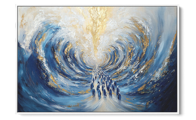
Consider what you are looking for in terms of the color temperature guidance covered earlier. "Prayers in Abstract," Bitton's interpretation of the Western Wall, works well in rooms that already carry cool, layered tones. The piece builds depth through movement and texture rather than through literal representation, which means it reads differently from six feet away than it does up close. That layering quality suits large walls where the viewer's relationship to the art shifts with distance.
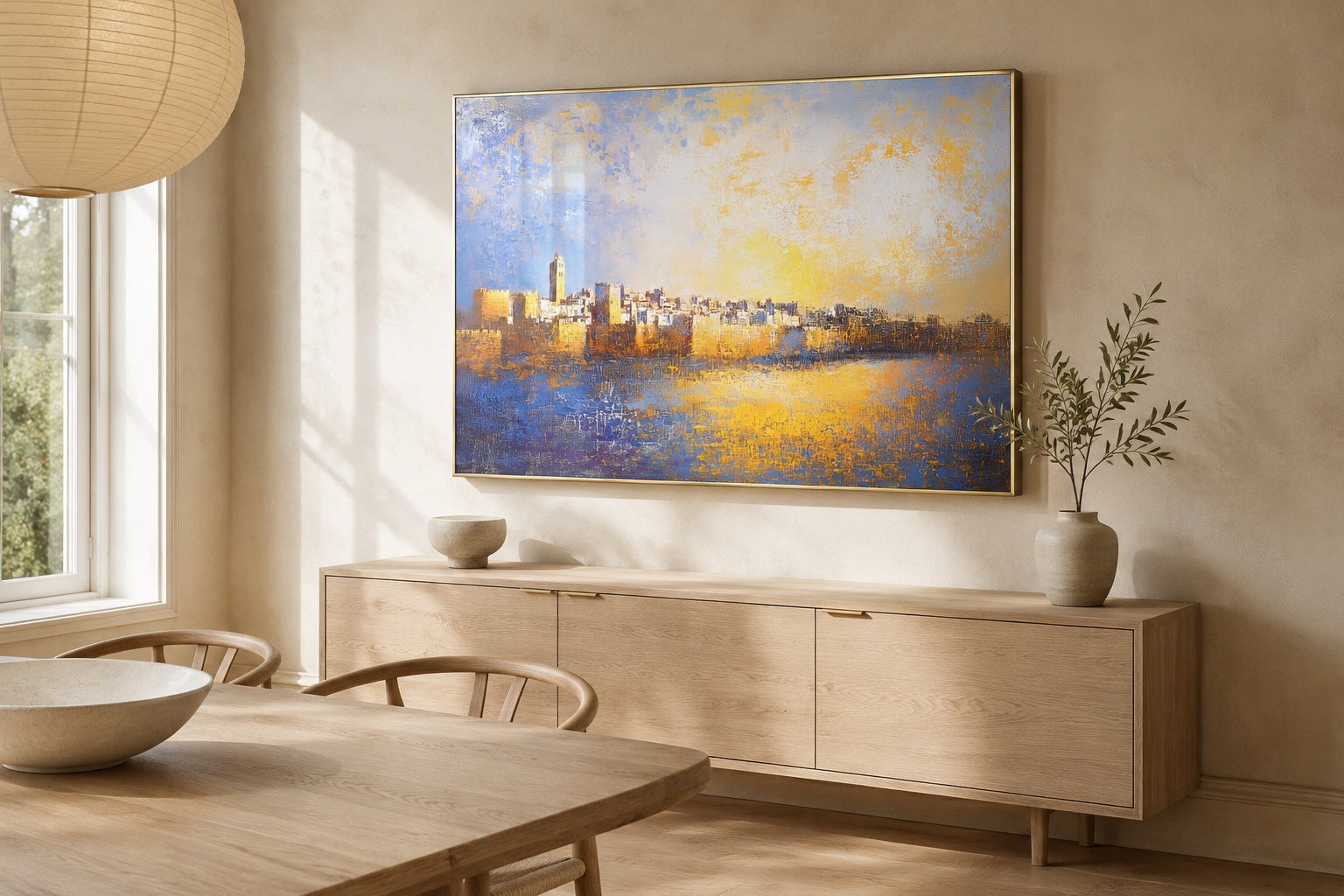
"Glorious Jerusalem" and "At the Gates of Jerusalem" carry a warmer palette and suit dining rooms, entryways, and living spaces where the light has a golden quality in the afternoon. Both hold the threshold and reverence themes discussed earlier in the entryway section, so they work as conceptual anchors for gathering spaces.
"A Mosaic of Prayer" and "The Old City of Jerusalem" are better choices for rooms where you want the surface of the work to be part of the experience. The mosaic quality in the former rewards close looking in a way that suits a study or a bedroom wall opposite the bed.
For dining rooms where you want the theme of harvest and land without the weight of holy site imagery, "The Seven Species of Israel" connects to the celebration of Israel's abundance in a way that reads joyful and generous rather than solemn. The piece suits warm, family-centered dining spaces and pairs well with natural wood furniture and earthy ceramic table settings.
Explore the full range of Western Wall art in modern Judaica if the Kotel theme resonates most with you. The variations in artist interpretation are significant: some lean toward figurative, others toward pure abstraction, and the difference matters a great deal in a contemporary interior.
Common Mistakes to Avoid When Styling Jewish Art in a Modern Interior
- Hanging pieces too small for the wall. A 12 x 16 inch canvas on a large living room wall reads as tentative. If the wall is more than 8 feet wide, think in terms of a single large piece or a deliberate grouping rather than a single small work.
- Clustering all Jewish art in one spot. Placing every Judaica piece near the front door or in the dining room fragments the home visually and suggests the art was collected out of obligation rather than love. Spread pieces across rooms based on their visual fit for that space.
- Choosing frames that contradict the art's style. As covered in the framing section, ornate frames undermine contemporary work. The frame is not neutral; it is part of the composition.
- Ignoring light conditions. Acrylic works shift significantly under different lighting. A piece that looks vibrant in natural light may appear flat under warm incandescent bulbs. Test the lighting before finalizing placement.
- Treating religious meaning as a reason to avoid good design decisions. A piece does not need to be hung prominently to be meaningful, and a piece does not become more meaningful because it is hung in a suboptimal spot out of deference. Good placement honors the art.
- Skipping scale planning on a gallery wall. Mixing sizes on a gallery wall works, but only with a clear alignment logic. Without a shared visual rule, the arrangement reads as random regardless of how strong the individual pieces are. The article on gallery wall ideas with Jewish art covers the Kotel-as-anchor approach in useful detail.

Frequently Asked Questions
Can Jewish art look modern without losing its religious or cultural meaning?
Yes, and the best contemporary Judaica demonstrates this. Meaning is carried through subject, intention, and the emotional quality of the work, not through a particular visual style. Abstract acrylic interpretations of the Western Wall or Jerusalem can be as spiritually resonant as a traditional painted piece; the difference is that they communicate through visual experience rather than through explicit symbol. The meaning deepens when a guest asks about a piece because it drew them in visually first.
Where is the best place to hang Jewish art in a modern home?
The answer depends on the piece's visual character and the room's function. Contemplative, layered works suit a home office or bedroom wall opposite the bed. Threshold and gate imagery works well in entryways and on dining room walls because the metaphor of passage or gathering resonates with the room's use. Large-format abstract pieces with strong color do well on living room sofa walls. The worst placement is wherever the art competes with another dominant visual element, a large window, a television, or an architectural feature, without enough wall space to breathe.
How do I mix abstract Judaica art with minimalist or contemporary furniture?
Pull one color from the artwork into a secondary element in the room: a textile, a ceramic object, or a natural material in a similar tone. Keep the surrounding furniture simple in silhouette so the art carries the visual energy. In very minimal rooms, one strong piece does more work than several smaller ones competing for attention. The key is giving the art enough clear wall around it so the negative space becomes part of the composition.
What size Jewish wall art works best in an open-plan modern living space?
In open-plan spaces, pieces need to read from a distance, often 20 feet or more. A single canvas under 30 inches wide will disappear. Aim for pieces 40 inches wide or larger for the primary sofa or dining wall. If you prefer a grouping, treat the cluster as a single unit and make sure the overall footprint still fills 57 to 75 percent of the wall width. Abstract works with clear tonal contrast are more legible at distance than detailed figurative pieces.
How do I create a gallery wall with Jewish art that does not look cluttered or overly religious?
Choose one anchor piece, ideally the largest and most visually complex, and build outward from it. Mix pieces with different levels of explicit religious imagery: one abstract work, one piece with recognizable but non-text-heavy imagery, and perhaps one secular piece that shares a palette. Stick to a single alignment axis (shared center, bottom, or top line) across the group. Maintain at least 2 to 3 inches of breathing space between frames. The result reads as collected rather than devotional when the visual relationships between pieces are as considered as the subject matter of each one.
Is abstract Judaica art appropriate for every room in the home?
Broadly yes, with one caveat around scale and intensity. Very high-contrast or visually energetic pieces are better suited to rooms people move through or gather in (living rooms, dining rooms, entryways) than to bedrooms, where the goal is rest. Bathrooms are often overlooked but work well with smaller-format abstract pieces, a 16 x 20 inch acrylic in a calm palette reads as thoughtful and personal in a well-lit bathroom. The subject matter is rarely the limiting factor; the visual energy and scale of the specific piece matter more.
If you are still building a sense of which artists and approaches suit your home, the full Yossi Bitton collection at Ben Ari Art Gallery brings together his complete range of acrylic Judaica, from intimate studies to large-format pieces, so you can assess scale, palette, and depth of abstraction across the body of work before deciding.
Read more
How to Choose Jewish Art for Home That Honors Holy Sites
A designer's framework for choosing Jewish holy-site art: pick a meaningful site, confirm the artist treats it with respect, and size and place it well.
Read more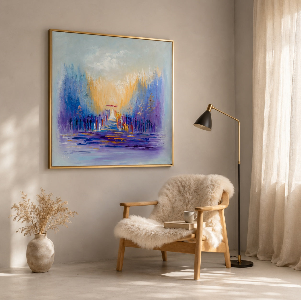
How to Decorate Jewish Home with Wall Art | Ben Ari Art Gallery
The challenge isn't finding Jewish art, it's knowing how to display it so it feels personal and current. A room-by-room guide with sizing rules, placement heights, and style frameworks for design-c...
Read more