
How to Choose Kotel Painting for Home: Style, Scale & Placement
How to Choose Kotel Painting for Home: Style, Scale & Placement
Knowing how to choose kotel painting for home comes down to four decisions: style, scale, color palette, and the emotional tone you want the piece to carry. Get those four right, and the work will feel like it belongs rather than like a statement you had to justify to yourself. This guide walks you through each decision in order, with specific measurements, palette advice, and framing notes drawn from years of placing sacred art in residential spaces.
Why a Kotel Painting Belongs in the Living Room
The living room is where a home makes its first real argument about who the people inside it are. Artwork placed here gets read every day, by family and guests alike. A Kotel painting does something most art cannot: it anchors a space spiritually without demanding a religious context to be legible. Even a visitor who has never been to Jerusalem will sense weight, history, and intention in those ancient stones.
Beyond meaning, the visual language of Western Wall art is remarkably compatible with high-end residential interiors. The warm limestone palette, the deep textures, the play of golden afternoon light across massive horizontal courses of stone: these are design elements that hold their own against natural wood furniture, raw plaster walls, or polished concrete floors. The Kotel is both a sacred site and a subject with extraordinary pictorial range.
If you are new to placing sacred art in a secular room, the article on displaying sacred art with intention offers a useful framework for thinking about placement and meaning before you choose a specific piece.

Step 1: Decide on Style First, Abstract, Impressionist, or Realistic Kotel Art
Style is the load-bearing decision. Everything else, scale, color, framing, follows from it. There are three distinct directions in contemporary Kotel art, and they suit different rooms and different buyers.
Realistic Kotel paintings
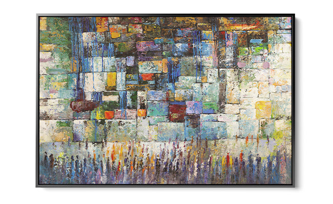
A realistic rendering shows the Wall as it is: the massive ashlar blocks, the tufts of vegetation that root in the joints, the crowd of worshippers dwarfed by the stones. This approach creates an almost documentary intimacy. It suits traditional, warm-toned living rooms with wood paneling, leather furniture, or Moroccan tile details, and makes a strong choice for buyers who want the painting to spark conversation about the actual place.
Impressionist or semi-abstract approaches
Many of the most compelling contemporary works occupy a middle ground. The stones are recognizable but loosened, the light is expressionistic, the figures are suggested rather than rendered. This is the territory where Yossi Bitton operates: his Moriah, Jerusalem uses brushwork that reads as photographic from across the room but dissolves into something almost painterly at close range. That tension is exactly what makes this style so livable. It does not demand constant attention, but rewards it.
Abstract Kotel art
A fully abstract piece translates the Kotel into geometry, texture, and color temperature rather than representation. Avigdor Ben Ari's Eternal Stones of the Kotel is a strong example: the composition captures the monumental horizontality of the stone courses without literally depicting them, so the painting reads as serious contemporary art to anyone in the room, while carrying specific meaning for those who know the subject. This is the right direction for minimalist, Japandi, or modern interiors where a representational painting would feel incongruous.
If you want to understand how abstract Judaica compares to more traditional imagery before committing to a direction, the guide on modern Judaica versus traditional Jewish decor lays out the key differences clearly.
| Style | Interior fit | Emotional register | Best wall type |
|---|---|---|---|
| Realistic | Traditional, warm, layered | Reverent, grounding | Feature wall, study |
| Impressionist / semi-abstract | Transitional, modern-warm | Meditative, luminous | Living room anchor |
| Abstract | Minimalist, modern, Japandi | Contemplative, strong | Clean white or plaster wall |

Step 2: Choose the Right Size and Scale for Your Wall
The single most common mistake in placing statement art is going too small. A piece that looks bold on a screen can feel tentative on a ten-foot wall. Here is the reliable sizing method used by most residential art consultants.
Measure the width of the furniture grouping the painting will sit above, whether that is a sofa, a console, or a fireplace surround. The painting should span between 57 and 75 percent of that width. A sofa that is 90 inches wide calls for a painting somewhere in the 51-to-67-inch range. Going narrower creates a mismatch in visual weight; going wider can crowd the composition.
Hanging height matters as much as width. The center of the canvas should sit at eye level, roughly 57 to 60 inches from the finished floor. If the painting hangs above a sofa, leave 6 to 8 inches between the top of the sofa back and the bottom edge of the frame. Any more and the piece floats; any less and it reads as a headboard.
For ceiling height, a standard 9-foot ceiling can handle a canvas up to about 48 inches tall without feeling cramped. Rooms with 10- or 12-foot ceilings are where large-format works, in the 60-to-72-inch range, really open up. The acrylic pieces in our Western Wall art collection are available in multiple sizes, so you can match the format to the wall rather than compromising.
Styling note: If you are working with a gallery wall that includes other Jerusalem or Jewish art, the Kotel piece should be your largest canvas, the visual anchor that everything else orbits. Plan its position first, then arrange the smaller pieces around it with at least 2.5 inches of breathing room between frames.

Step 3: Match the Color Palette to Your Living Room
Western Wall paintings draw from a narrow but versatile palette: warm limestone creams, sandy ochres, burnt sienna, deep umber shadows, and the occasional wash of gold or blue sky. That palette sits in the warm-neutral zone of the color wheel, which means it harmonizes naturally with a wide range of interiors.
Here is a simple three-step palette check before you buy:
- Pull one dominant color from the painting. Hold a paint chip or fabric swatch against your screen, or request a physical sample if the gallery offers one. The dominant warm stone tone should either repeat a color already in the room (a wood floor, a leather sofa, a linen rug) or complement a cool neutral (gray plaster, white oak, pale sage).
- Check the painting's shadow tones. Some Kotel paintings lean toward cool blue-gray shadows (read: contemporary, serene). Others carry warm brown-red shadows (read: rich, grounding). Cool shadows work in rooms with a lot of white, glass, or metal. Warm shadows work better in rooms with wood, stone, and textile layering.
- Consider the accent color. If the painting includes figures in prayer shawls, or a wash of gold light at the top of the stones, check whether that accent color creates a connection to anything else in the room: a cushion, a lamp base, a candlestick on the shelf below.
Yossi Bitton's A Mosaic of Prayer is a useful example of a painting with a complex internal palette. It layers warm golds and deep blues in a way that can anchor a room built around navy and natural linen, or hold its own in a more monochromatic cream-and-oak scheme, depending on which tones you choose to echo in the surrounding furnishings.
Curator's note: Acrylic prints on aluminum substrate, which is the medium used across this collection, tend to read slightly more saturated than the same image on canvas. If your living room is already rich in color, request a preview of the piece in its printed form, not just the digital rendering, before finalizing.

Step 4: Consider the Mood and Spiritual Tone You Want to Set
This is the step that most buying guides skip, and it is arguably the most important one for a sacred subject like the Kotel.
Ask yourself how you want to feel when you look up from the sofa. There is a real difference between a painting that invites a moment of stillness and one that actively reminds you of obligation, history, or longing. Both are valid. Both produce very different rooms.
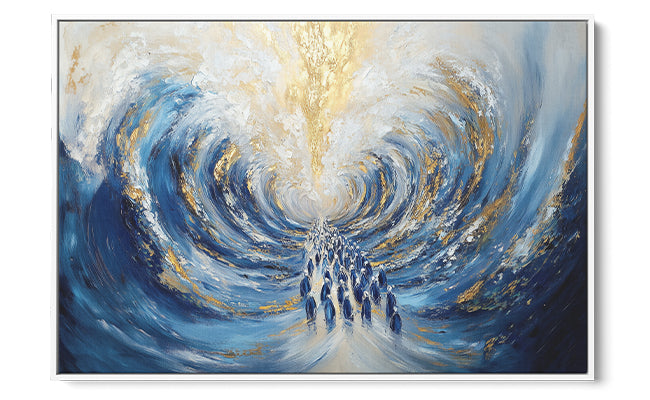
For a living room used primarily for gathering, entertainment, and family, a painting that reads as luminous and warm is usually the right call. Yossi Bitton's At the Gates of Jerusalem has that quality: it uses light in a way that feels expansive rather than somber, which makes the room feel welcoming rather than solemn.
For a more private space, a reading room or a home office that opens onto the living room, a painting with more tonal contrast and gravitas, deeper shadows, more monumental stone, less sky, will feel appropriate rather than heavy.
Consider also the direction of the light in the painting. A composition where the light comes from the upper left, as in many dawn-at-the-Kotel depictions, will respond differently to a room lit from the right than one where the painted light matches the room's actual window position. When they align, the painting feels like it was made for the wall.
Step 5: How to Evaluate a Piece Before You Buy
Buying art online requires a different kind of scrutiny than buying in a gallery. Here is what to check before committing.
- Medium and substrate. Acrylic face-mounted prints on aluminum or acrylic substrate are the current standard for archival-quality fine-art prints. They resist fading, do not warp with humidity, and require no glass, which eliminates glare. All the pieces in this collection use this medium.
- Size options relative to your wall measurement. Confirm the gallery offers the size you calculated in Step 2, not just a close approximation. A few inches in either direction can shift the balance of the composition.
- Artist provenance. Knowing that a piece was created by a specific Israeli artist, Avigdor Ben Ari and Yossi Bitton both have documented exhibition histories, gives you confidence that the work is original rather than a stock image licensed to a printer.
- Return and replacement policy. For large-format pieces, shipping damage is a real risk. A gallery that offers a damage guarantee matters.
- Color accuracy of the preview image. Check whether the gallery shows the piece in a styled room context, not just on a white background. Room context gives you a far more honest sense of scale and tonal weight.
If you want to go deeper on this topic before purchasing, the article on choosing Jewish wall art for your home covers style, scale, and subject in additional detail.

Kotel Paintings Worth Considering and How to Choose Among Them
With the four decisions made, narrowing to a specific piece becomes much more straightforward. Here is how several works in the collection map to the principles covered above.
If you landed on abstract, clean interiors, and a contemplative mood: Avigdor Ben Ari's Eternal Stones of the Kotel is the most architecturally minded work in the group. The composition privileges the geometry of the stones over any specific moment in time, which means it reads differently each time you look at it. It suits Japandi and modern interiors and hangs naturally above a low credenza or a floating shelf.
For a semi-abstract approach in a warm, layered room: the Western Wall Wall Art by Ben Ari occupies that productive middle ground between documentation and expression. The stones are unmistakable but the handling is loose enough to feel painterly. It suits rooms where you have already committed to warm wood tones and want the art to add depth rather than contrast.
Yossi Bitton's body of work brings a different sensibility. His Moriah, Jerusalem is the most quietly confident piece he has contributed to this collection: the light is diffuse, the palette restraint is deliberate, and the composition benefits from a clean wall with no competing artwork nearby. It is the kind of painting that gets noticed by guests who cannot immediately say why they were drawn to it.
A Mosaic of Prayer and At the Gates of Jerusalem, both by Bitton, carry more internal movement and are better suited to larger walls where the eye has room to travel. If the Kotel painting discussion in the gallery wall article resonates with you, those two pieces make natural anchors for a Kotel-centered gallery wall arrangement.
The full range of Avigdor Ben Ari's Judaica collection and the Yossi Bitton collection are worth exploring side by side if you want to understand each artist's full visual vocabulary before deciding which direction suits your room.

Placement, Lighting, and Framing: The Final Decisions
Once the piece is chosen, three practical details will determine whether it reaches its full potential on the wall.
Placement
The living room's primary sofa wall is the natural home for a large Kotel painting. If that wall already carries a television, consider the wall perpendicular to it, visible from the main seating position but not competing with a screen. The painting needs to be the dominant visual on its wall, not one of several.
Lighting
Warm-toned picture lighting, either a hardwired picture light mounted to the frame or an adjustable track head aimed at the canvas, makes a significant difference with stone-palette paintings. The warm limestone tones in most Kotel works respond well to a 2700K to 3000K light source. Avoid cool-white LEDs, which flatten the ochre and push the palette toward gray. If you rely on natural light, a north- or east-facing wall gives consistent, diffuse illumination without the UV exposure of direct afternoon sun.
Framing
Acrylic face-mounted pieces typically arrive frameless, and most of them look best that way. The clean edge reinforces the contemporary quality of the medium. If you prefer a frame for a more finished look, a simple floater frame in natural oak or brushed brass adds warmth without drawing attention away from the image. Avoid ornate gold frames on abstract or impressionist pieces; they create a style conflict that undermines both the frame and the painting.
Designer's tip: For rooms with high ceilings and large windows, hang the painting 2 to 3 inches higher than the standard 57-inch center line. The extra height reads as intentional in tall rooms and keeps the piece from feeling pushed down by the architecture.
One mistake to avoid
Do not place a Kotel painting directly opposite a large mirror. The reflected duplication flattens the spiritual presence of the subject and turns a singular image into a decorative pattern. The painting earns its wall; give it one.
For additional context on how Kotel and other holy-site paintings sit within the broader category of contemporary sacred art, the Jewish holy sites art collection shows how the same sites can be treated across very different visual registers.
Frequently Asked Questions
What size Kotel painting works best for a living room?
For most living rooms, aim for a canvas that spans 57 to 75 percent of the furniture width it will hang above. A standard 90-inch sofa calls for roughly 51 to 67 inches of canvas width. Rooms with ceilings above 10 feet can absorb canvases up to 72 inches tall without crowding; standard 9-foot ceilings top out comfortably around 48 inches of height. Always measure the actual wall before choosing a size from the available options.
Should I choose an abstract or realistic Kotel painting for a modern home?
In a true modern interior, with minimal ornament, clean lines, and a restrained material palette, an abstract or semi-abstract Kotel painting is almost always the stronger choice. A highly realistic oil-style rendering can feel stylistically mismatched against modern furniture even if the subject is compelling. If the realism is executed with a graphic, high-contrast approach rather than a soft painterly one, it can hold its own in a contemporary room. The key test: does the painting's handling feel consistent with the rest of the room's visual language?
What color palette is most common in Kotel paintings and how do I match it to my decor?
The dominant palette is warm limestone: creamy beige, sandy ochre, burnt sienna, and umber, with sky tones ranging from deep blue to pale gold depending on the time of day depicted. This palette is friendly to interiors built around natural wood, warm white, terracotta, brass, and linen. It can also anchor a room with cooler neutrals if the painting's shadow tones lean toward blue-gray. The practical shortcut: pull the lightest tone in the painting and confirm it appears somewhere in the room, even in a small textile or a ceramic object on a shelf.
Is a Kotel painting appropriate in a non-Jewish home or as a gift?
The Kotel is a sacred site, but it is also one of the most recognized architectural subjects in the world, with visual gravity that transcends any specific practice. In a non-Jewish home, a beautifully executed abstract or impressionist Kotel painting reads as serious contemporary art with historical weight. As a gift, it is most appropriate for someone with a personal or cultural connection to Jerusalem or to Jewish history. If the recipient has no such connection, a piece from the broader Jerusalem art collection may offer a less specific entry point.
How do I know if a Kotel painting is high quality before buying online?
Three markers matter most. First, the medium: acrylic face-mounted prints on aluminum substrate are archival, warp-resistant, and do not require UV glass. Second, artist attribution: a named Israeli artist with a documented body of work is a meaningful quality signal, not just a marketing detail. Third, size range: a printer working from licensed stock typically offers three or four generic sizes; a serious art gallery can print to multiple dimensions because the source files have the resolution to support it. If the gallery cannot confirm the source file resolution for your chosen size, that is a red flag.
Can I hang a Kotel painting in a room that already has other Jerusalem or Jewish art?
Yes, but give it hierarchy. The Kotel painting should be the largest piece and occupy the primary wall position; smaller works in the room should complement rather than compete. Avoid hanging two Kotel paintings in the same room at similar scales; the repetition dilutes the singular power each one would carry alone. If you want to build a full gallery wall anchored by the Kotel, keep the surrounding pieces smaller, in related but distinct subjects (other holy sites, abstract Judaica, portraiture), and leave consistent spacing between frames. The contemporary Jewish wall art collection has smaller-format pieces that layer well around a central Kotel anchor.
When you are ready to compare specific pieces side by side, the Western Wall art available at Ben Ari Art Gallery brings together works by Avigdor Ben Ari and Yossi Bitton across multiple sizes and approaches, all produced on archival acrylic substrate. You will find the full range, with room-context previews and size options, in the Kotel and Western Wall art gallery.
Read more
How to Choose Jewish Art for Home That Honors Holy Sites
A designer's framework for choosing Jewish holy-site art: pick a meaningful site, confirm the artist treats it with respect, and size and place it well.
Read more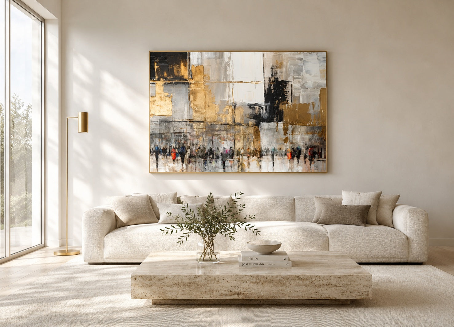
How to Display Jewish Art in Modern Home Without Losing Meaning
Treat the work as art first and symbol second. A room-by-room guide to placement, framing, scale, and pairing for contemporary Jewish wall art.
Read more