

Article: Best Abstract Jewish Art for Home: Living Rooms and Entryways

Best Abstract Jewish Art for Home: Living Rooms and Entryways
Best Abstract Jewish Art for Home: Living Rooms and Entryways
The best abstract jewish art for home combines meaningful symbolism with genuine visual sophistication, making it easy to live with every day without feeling like a religious object on a shelf. Abstract Judaica works precisely because it distills sacred ideas, Jerusalem, prayer, the Land of Israel, into form, color, and texture rather than illustration. The result fits naturally into living rooms and entryways designed around contemporary taste, not despite the spiritual content, but because of how that content has been interpreted.
If you have been hesitating because you worry abstract Jewish wall art might feel too literal or too bold for a refined interior, this guide walks through exactly how to choose, where to hang, and what to look for, with specific sizing, palette, and placement advice for the two rooms where it matters most.
What Makes Abstract Jewish Art Different from Traditional Judaica
Traditional Judaica tends toward the illustrative: menorahs rendered in fine detail, Hebrew text laid out in calligraphy, figures in ceremonial dress. It signals identity clearly and directly. Abstract Jewish art takes a different approach. It treats the same source material, the Western Wall, Jerusalem's stone and light, the seven species of the Torah, as emotional and compositional raw material rather than as subject matter to be depicted faithfully.
The distinction matters for a buyer because it changes how the work functions in a room. A realistic painting of the Kotel reads as a devotional image. An abstract interpretation of the same subject reads as a serious work of contemporary art that also carries devotional weight. You don't have to choose between aesthetic integrity and spiritual meaning. That's the defining quality of the best abstract Judaica.
For a deeper look at how this distinction plays out across styles and periods, the article modern Judaica wall art vs. traditional Jewish decor is worth reading before you decide on a direction.
Abstract Judaica also tends to be made with materials that suit high-end interiors. Acrylic prints, in particular, produce an image depth and color saturation that neither canvas nor paper can match. The surface catches light differently at different times of day, which makes the work feel alive in a way a flat lithograph does not.

Why Living Rooms and Entryways Are Ideal Spaces for Abstract Judaica
Not every room in the house calls for the same kind of art. Bedrooms often want something quieter. Dining rooms can handle narrative or representational work because people sit with it for a long time. Living rooms and entryways are different: they need pieces that make an immediate impression and hold up under repeated viewing from multiple angles and distances.
Abstract Jewish art is well-suited to both spaces for related but distinct reasons.
In a living room, the work anchors the room visually. A large-format abstract piece placed behind a sofa or above a fireplace becomes the organizing element that everything else responds to. The colors you pull from it can guide your throw pillows, rug, and accent furniture. The spiritual dimension adds a layer of intention that purely decorative art can't offer.
In an entryway, abstract Judaica functions as a statement of values the moment someone walks through the door. It says something about how the household sees itself without requiring explanation. Because entryways are typically narrow with limited natural light, the high-gloss depth of an acrylic print is particularly effective: it holds luminosity even in lower light conditions where a matte canvas would look flat.
For a broader room-by-room perspective on where Jewish art performs best, the guide on Jewish art styles for home decor by room covers the full picture.
Curator's note: In a foyer with a console table, hang the piece so its vertical center sits at roughly 57 inches from the floor. That's the established gallery standard, and it reads correctly whether a visitor is standing or leaning in to look closer.

Key Subjects and Symbols Found in Abstract Jewish Art
Understanding the symbolic vocabulary helps you choose a piece that resonates beyond its visual surface. Here are the subjects that appear most often in contemporary abstract Judaica, and what each brings into a space.
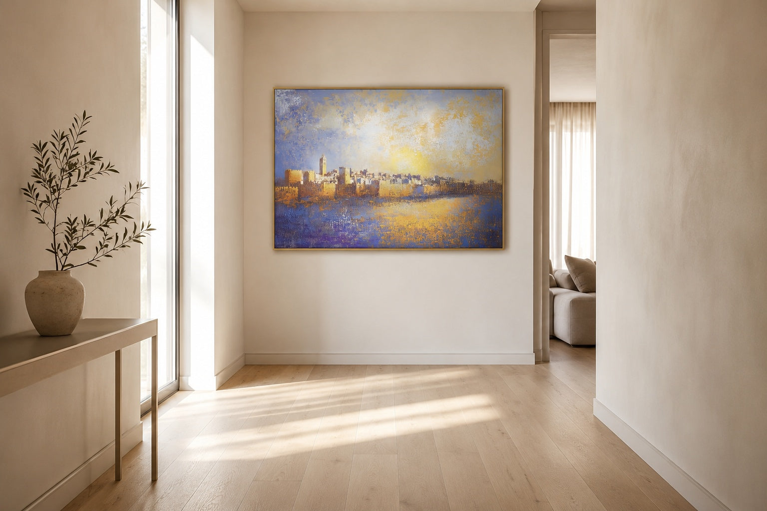
- Jerusalem and the Old City: The most recurring subject in the genre. Artists abstract the city's golden stone, its arched gates, and its layered skyline into color fields and geometric forms. Works in this vein carry a sense of permanence and longing that reads across religious backgrounds.
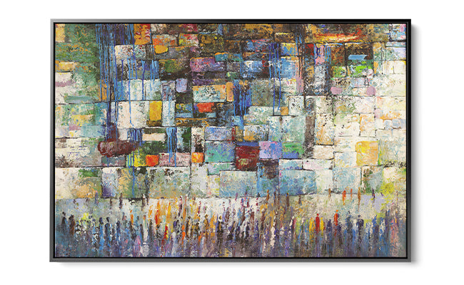
- The Western Wall (Kotel): The texture of the ancient stones becomes an almost compositional device in abstract form, layered marks and surface variation suggesting the accumulated weight of centuries of prayer. Pieces inspired by the Kotel tend to have strong vertical movement and tonal depth.
- The Seven Species of Israel: Wheat, barley, grapes, figs, pomegranates, olives, and dates, the seven crops named in Deuteronomy as the blessing of the Land. Abstract interpretations usually lean into warm ochres, deep reds, and olive greens, making them particularly natural in kitchens, dining rooms, and spaces with earthy palettes. They also work beautifully in living rooms where a purely architectural subject would feel too dominant.
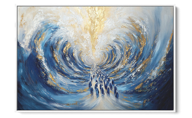
- Prayer and devotion: Some works abstract the act of prayer itself, figures dissolving into light, text fragmented into pure form. These tend toward softer edges and more luminous color palettes.
- Gates and thresholds: Jaffa Gate, the Damascus Gate, and other Jerusalem entry points appear in abstract form as archetypal imagery of passage and arrival. Thematically, these translate perfectly to an entryway.
The Jewish holy sites art collection is a good reference for seeing how different artists interpret the same subjects.

How to Match Abstract Jewish Art to Your Interior Style
The right approach here is a three-step method: start with mood, then move to color temperature, then settle scale. In that order, you avoid the most common mistake, which is choosing a piece for its size and then trying to force the palette and feeling to work around it.
Step 1: Identify the mood you want the room to hold
Do you want the space to feel contemplative and still, or vibrant and energized? Jerusalem and Kotel subjects tend toward the contemplative end: deep blues, golds, and muted stone tones. The Seven Species and gate imagery can move in either direction depending on the artist's palette. Pin down the emotional register before you look at any specific piece.
Step 2: Match color temperature to your existing palette
Warm-toned interiors (walnut wood, terracotta, cream) absorb warm-gold Jerusalem pieces naturally. Cool, light-flooded rooms with white walls and concrete or light oak respond better to works with cooler blue-gray or violet undertones.
A neutral-plus-accent room, say, greige walls with brass hardware and a cognac leather sofa, is genuinely flexible but needs deliberate direction. In that case, decide which element you want the art to reinforce: if the brass is the room's strongest accent, a piece with warm gold tones deepens that note; if the leather is doing the warmth work, a piece with cooler stone or dusty blue pulls the eye in a complementary direction. Either approach works; drift in both directions at once and the composition will feel unanchored. The principle holds: contrast creates interest, so avoid a dominant hue that already saturates the furniture.
Step 3: Fix scale relative to the wall
The standard rule for a sofa wall is that the artwork should span roughly two-thirds of the sofa's width. For a console table in an entryway, the piece should be no wider than the table itself and should leave at least eight inches of wall on each side. These proportions feel balanced to the eye without measurement.
Styling note: Abstract Jewish art reads differently in different interior styles. Pieces with strong geometric structure and limited color palettes (two or three tones) suit minimalist, Japandi, and Scandinavian interiors. Works with richer, more layered color and visible brushwork or texture respond well to warm modern, Mediterranean, and eclectic spaces. Industrial lofts benefit from large-format pieces with strong contrast.
Here's a quick reference for matching piece character to interior style:
| Interior Style | Palette to Look For | Subject That Fits | Format |
|---|---|---|---|
| Minimalist / Japandi | 2-3 tones, muted golds, cream, charcoal | Western Wall, gates | Single large acrylic, 30-48 inches wide |
| Warm Modern | Ochre, terracotta, deep blue | Jerusalem cityscape, Seven Species | Large single or diptych, 40-60 inches wide |
| Contemporary Glam | Gold, navy, ivory | Glorious Jerusalem, prayer abstraction | High-gloss acrylic, 48 inches or wider; the reflective surface rewards the scale |
| Eclectic / Boho | Warm mixed palette, texture-forward | Seven Species, mosaic prayer | Canvas or mixed media, 24-40 inches; the textured surface reads better than acrylic alongside natural fibers and rattan |

Top Abstract Jewish Art Picks for Living Rooms and Entryways
The pieces below are all from Yossi Bitton, whose abstract Judaica is designed specifically for residential interiors and produced on acrylic, which delivers the color depth and surface quality the subjects demand. To explore Bitton's abstract Judaica wall art collection in full, the range is wider than what's covered here.
For a living room statement wall: Glorious Jerusalem
When the goal is a single piece that commands a large wall, look for work with both vertical movement and a palette deep enough to hold attention from across the room. "Glorious Jerusalem" achieves this by abstracting the Old City's layered light into color fields that shift from warm gold at the base through amber mid-tones to cooler, more atmospheric blue-gray above, three distinct registers held in productive tension by a strong vertical axis. Available starting at 320 dollars, it scales up significantly for larger walls, which matters if the sofa you're working with runs beyond 90 inches.
For a contemplative living room with a neutral palette: Prayers in Abstract
Works that interpret the Kotel in a non-literal way tend to hold up better in rooms where the furniture is already doing expressive work. "Prayers in Abstract" treats the Western Wall as texture and vertical rhythm rather than a photographic reference point, which lets it sit quietly in a sophisticated interior without disappearing. It suits rooms where the existing palette is bone, linen, or warm white, where the art needs presence without competition.
For a layered, richly toned living room: A Mosaic of Prayer
Look for pieces where the surface complexity matches the complexity of the room around them. "A Mosaic of Prayer" draws on the fragmented, tessellated quality of ancient tilework and brings it into a contemporary color register. It performs particularly well in rooms with mixed materials, leather, stone, textured plaster, where a simpler composition would get lost.
For an entryway with a narrow wall: At the Gates of Jerusalem
Gate imagery carries obvious thematic weight in an entry space, but the compositional reason to choose it is equally practical. Works organized around a central vertical axis, as gate subjects tend to be, read clearly in the narrow proportions of a foyer wall. "At the Gates of Jerusalem" has this quality: the composition pulls the eye inward, which creates depth in a shallow space.
For a warmer, more organic entryway: Seven Species of Israel
Not every entryway calls for architectural drama. In a home with natural wood floors, warm plaster walls, or significant plant life, a piece built around botanical and agricultural symbolism lands with more ease. The Seven Species subject brings warmth and abundance into the entry without the formal weight of a cityscape. Starting at 300 dollars, it's also the most approachable entry point in Bitton's range for buyers trying a larger abstract piece for the first time.
Designer's tip: If you are choosing between the Jerusalem Jaffa Gate piece and At the Gates of Jerusalem for an entryway, the deciding factor is usually wall width. Jaffa Gate has a more horizontal composition and reads better on walls wider than 48 inches. The Gates piece works on narrower walls without feeling cramped.

How to Hang and Display Abstract Judaica for Maximum Impact
The practical decisions around hanging matter as much as the choice of piece itself. A few principles that apply specifically to abstract Judaica in acrylic:
- Avoid direct sunlight on acrylic prints. The surface intensifies light beautifully under ambient conditions, but prolonged direct sun causes color shift over time. Position the piece where it receives good indirect light, ideally from a window to the side rather than directly opposite.
- Leave breathing room. Abstract works need space around them to read as art rather than decoration. A minimum of 8 to 10 inches of wall visible on each side is the practical floor for a single statement piece. Less than that and the composition starts to feel crowded by the architecture.
- Hang above furniture at the right gap. The standard gap between the top of a sofa or console table and the bottom of the frame is 6 to 8 inches. Less than 6 inches and the piece reads as attached to the furniture rather than belonging to the wall.
- Use picture rail hooks or heavy-duty adhesive strips for entryways with plaster walls. Many high-end homes have plaster walls where drilling creates disproportionate damage. Adhesive hanging strips come in rated pairs; check the manufacturer's weight specification for each strip count and verify it against the actual piece weight before ordering. Heavier acrylics require multiple pairs, and weight ratings vary by brand.
- Light it intentionally. A small adjustable picture light mounted above the piece, or an angled track light from the ceiling, adds dimension that ambient room lighting doesn't. This is especially effective in entryways where natural light is limited.
For a more detailed approach to displaying sacred art with spatial intention, the article on displaying sacred art with intention goes deeper into placement strategy.
Common mistakes to avoid
- Hanging too high. The 57-inch center rule (floor to the vertical midpoint of the piece) is the established gallery standard because it works. In entryways where people are often moving, hanging higher than 64 inches at center makes the work feel disconnected from the human experience of the space.
- Choosing a size that's too small. A single piece that is too small for its wall reads as tentative. If the wall is 8 feet wide, a 24-inch print will look like a postage stamp. Size up before you size down.
- Grouping abstract pieces without a unifying element. Gallery walls of abstract Judaica work when the pieces share a color family or a subject thread. Mixing unrelated subjects and palettes produces visual noise, not conversation.
- Ignoring frame or edge finish. Acrylic prints typically float off the wall on standoffs, which creates shadow depth and a clean contemporary edge. This is usually the right finish for abstract Judaica in a modern interior. A heavy ornamental frame can work against the abstraction.

Where to Find the Best Abstract Jewish Art Online
The online market for abstract Judaica has grown considerably, but quality is uneven. The criteria that separate serious work from decorative reproduction are: original composition (not a filtered photograph), quality of print substrate, and a cohesive artistic vision across the body of work.
Yossi Bitton meets all three. His acrylic pieces are built on original painted compositions, not photographic derivatives, and the range scales from accessible entry sizes (starting at 300 to 320 dollars depending on the subject) up to statement-scale formats above 1,200 dollars for the largest pieces. That range means you can test a medium-format piece in a space before committing to a room-defining large one.
The Jerusalem modern Jewish art collection is a useful starting point if the Old City subjects covered earlier felt right for your space. For buyers drawn specifically to Western Wall interpretations, the Western Wall art collection gathers those works in one place.
If you want to compare Bitton's abstract approach against a different artistic sensibility, the Jewish life and modern Judaica collection includes work by other artists whose styles range from figurative to gestural abstraction, which helps calibrate where Bitton's palette and compositional discipline sit relative to the broader field.
One angle most buyers don't consider: think about how the work will age with the room. Abstract Judaica built on timeless subjects (the Kotel, Jerusalem, prayer) and restrained palettes tends to outlast trend-driven decorative art by years. The pieces that feel right five years after purchase are almost always the ones chosen for the strength of the composition, not because they matched the sofa.
Frequently Asked Questions
What is abstract Jewish art and how is it different from decorative Judaica?
Abstract Jewish art uses the visual language of contemporary fine art (color, form, texture, composition) to interpret Jewish subjects and symbols, rather than depicting them literally. Decorative Judaica, by contrast, is primarily illustrative or ornamental: a Hamsa with painted flowers, a Shabbat scene rendered in folk style. The practical difference is that abstract Judaica holds up as serious wall art in rooms designed around current interior aesthetics, while decorative Judaica reads more as a religious object placed in a domestic setting.
Can abstract Judaica art work in a modern or minimalist home?
Yes, provided you choose pieces with disciplined palettes and clean edges. The key is avoiding works that feel busy or illustrative even under an abstract label. For minimalist interiors specifically, look for pieces with a maximum of three dominant tones and strong compositional structure, a clear horizon, a central axis, or a dominant vertical movement. Bitton's Western Wall pieces in muted gold and stone tones are a reliable fit for rooms with white walls, light wood, and clean-lined furniture.
What symbols are commonly used in abstract Jewish wall art?
The most common subjects are Jerusalem's architecture and light, the Kotel (interpreted through texture and vertical rhythm rather than literal stone), the seven agricultural species named in Deuteronomy, and threshold imagery like gates. Some works also incorporate fragmented Hebrew letterforms as visual elements rather than readable text. Each carries distinct symbolic weight: Jerusalem suggests permanence and longing, the Kotel suggests accumulated prayer, the Seven Species suggest abundance and rootedness in the Land.
What size abstract Jewish art piece works best for a living room?
For a sofa wall, the piece should span approximately two-thirds of the sofa's width. A standard 84-inch sofa calls for a piece roughly 56 inches wide. If you're working with a single large piece rather than a grouping, err toward the larger end of the size range the artist offers: a piece that feels slightly oversized when it arrives almost always looks right once it's on the wall and furniture is in place. Pieces that feel right on the floor often look undersized when hung.
Is abstract Judaica art appropriate for an entryway or foyer?
It's one of the best placements for it. The entryway is where a home makes its first argument about what matters to the people inside, and abstract Judaica does that without requiring explanation. Gate and threshold subjects (Jaffa Gate, At the Gates of Jerusalem) carry obvious thematic resonance in this space. For narrow foyers, prioritize compositions with a strong central vertical axis rather than wide horizontal compositions, which can feel truncated when the available wall width is limited.
How do I choose between different abstract Jewish art styles for my home?
Start with mood before subject: do you want the space to feel still and meditative, or warm and alive? Kotel and prayer-inspired works tend to be cooler in tone and quieter in surface energy. Jerusalem cityscape pieces and the Seven Species tend toward warmth and movement. Once you know the emotional direction, match color temperature to your room (see the step-by-step method above), and only then evaluate specific pieces. Choosing by subject or style alone, without anchoring first to mood and palette, is the most common reason buyers feel something isn't quite right after the piece arrives.
Read more
Jewish Home Decor Ideas Modern: Tradition Meets Design
A room-by-room guide to modern Jewish home decor: how to choose anchor pieces, build a Jerusalem stone palette, and keep meaning intact without clutter.
Read more